I’m a keyboard guy. And I think keyboards suck. In fact, I wrote about this before…
I found two new ugly specimens for today’s little rant, and your perusal. Both these keyboards have a reasonably traditional layout, but both fail, for different reasons. These two keyboards were in our conference room.
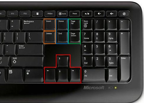
What’s wrong with this?
- It has no gaps between the different parts of the keyboard. Muscle memory fail.
- It has a bizarre scooped out shape, not really visible in the photo, which seems to encourage pressing the wrong row of keys.
- It has no gaps. This is so bad that it bears repeating. Without gaps, you have to look for the key because you can’t feel for it. Every time.
I thought I was the only one who really hated this keyboard with a passion, but enough other people complained about it that we replaced it with a Dell keyboard. I don’t know what has happened to the Microsoft keyboard. It’s entirely possible someone burned it.
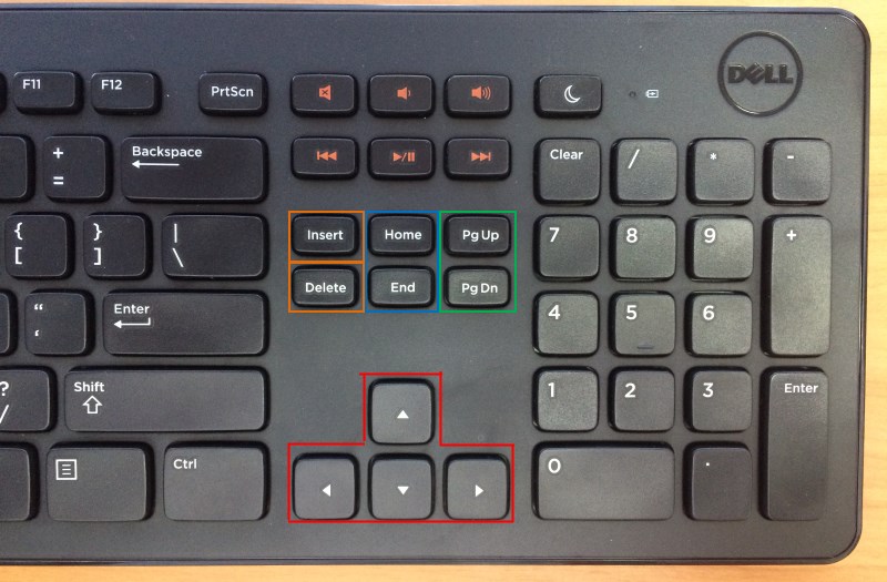
So this one, at first glance, improves on the Microsoft keyboard by reintroducing that classic design feature: white space, or black space. Just space. Y’know, gaps between different parts of the keyboard. Space is not entirely at a premium on our conference room table. But:
- The keys are modern funky flat keys with an unsatisfying deadness to them.
- The wrong size! Little tiny navigation keys for big fingers.
- And the media keys are encroaching on the navigation key space.
- What is the Clear key for? And what have you done with Num Lock? And Scroll Lock? And Pause/Break?
- I have nothing against the moon, but why do we need a moon key on our keyboard?
These things cost us time and productivity. It may seem minor, but moving between keyboards has become a constant frustration. I wish we as an industry could do better.
What a coincidence: I’m at an ISO meeting this week discussing amendments to the ISO/IEC 10646 standard (the ISO equivalent to Unicode), and one of the particular characters we discussed was the POWER SLEEP SYMBOL which has the appearance of a crescent moon.
Hi Peter, thanks for reading 🙂 Did all the sociopolitical connotations get discussed?
Where is the pause Break button?