A follow-up post, 29 Sep 2014: Cursor Keys Have Not Improved.
As you may know, I do a fair bit of work with keyboards. This means I have collected quite a number of hardware keyboards over the last few years. I do a lot of testing with various keyboards and use a number of computers with different hardware keyboards for both testing and development purposes.
One of the more irritating issues I experience moving between these keyboards is in the way manufacturers keep rearranging the cursor key block. As a touch typist, I am continually pressing the wrong cursor key, or Delete instead of Home, and so on. And that’s just the desktop keyboards. When it comes to notebooks I have lost all hope.
The ISO/IEC 9995-5 standard does require keyboard manufacturers to keep those cursor keys in one of two shapes:
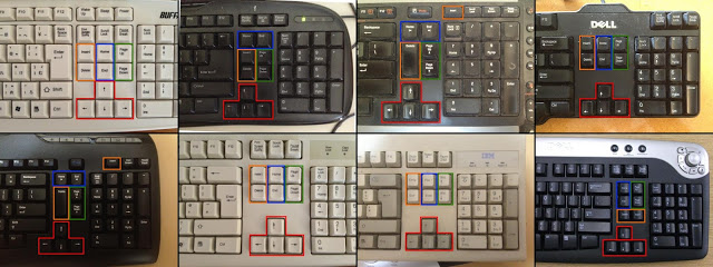
That’s it. Not very prescriptive. One almost wonders why they bothered! So let’s have a look at the problem with the keyboards in my office. Starting with desktop keyboards, I found 12 keyboards on and around my desk (and one in a second office), with no less than 6 different arrangements of this cursed cursor zone. I have included 8 of the keyboards in the image below:
 |
| Eight keyboards. Can you spot the ones with identical cursor layouts? |
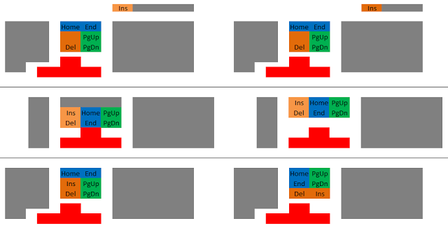
I drew up the six different layouts I found, grouping the keys by colour (sorry if you are colour blind). The top two layouts seem to be where most keyboards are going today. The middle two are more traditional, and the final two layouts were invented, I am convinced, purely to cause me grief.
I aligned the layout diagrams with the right hand side of the main alphanumeric keyboard block: this reflects where my hands sit normally. I hardly need to explain the difficulties with the constant rearrangement of the Home, End, PgUp, PgDn, Ins and Del keys, but I will note that the inconsistency of the cursor block position is almost as much of a problem: I get used to the position of the down arrow key on one keyboard, switch to another keyboard and find myself hitting left arrow instead from muscle memory.
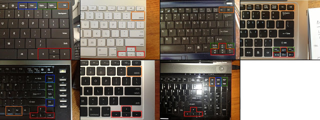
Notebook manufacturers have somewhat more of an excuse: they are trying to fit a bunch of keys into a much smaller space. Even so, the variety is pretty amazing. I didn’t even include the couple of dead laptops that have not yet made their way into the rubbish. Apple and Acer take top marks for consistency. Toshiba, not so much… I threw in a Microsoft Surface RT tablet keyboard for good measure! Some of the keyboards use the Fn key to access PgUp, PgDn, Home or End (or even Del). These are of course very inconsistently mapped, if you can even find them…
 |
|
| Surface RT, MacBook, Acer netbook, Acer ultrabook, Toshiba notebook, MacBook, Toshiba notebook |
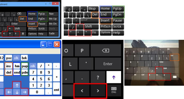
Even soft keyboards suffer. The following 5 images are all from the same company, Microsoft. Of note is that the position of the Fn key changes between Windows 7 and Windows 8. In 3 of the images, the position of the up arrow key is just slightly misaligned with the down arrow; this may not be a problem in use but it is visually irritating!
 |
| Windows 8 Accessibility, Windows 7 Accessibility, Windows XP, Win 8 Touch Optimised, Win 8 Touch Full. |


Oh yes…first thing I look at when buying a keyboard is the layout of the cursor block.
I don’t even pretend to understand the logic of changing that layout.