What is it with software download sites and their download links? Typically if you visit a website to download software, especially free or open source software, you’ll be presented with a page with several big green download buttons. Often the actual download will be a link buried to one side or somewhere halfway down the page. Nearly every site offering free software does this. And it sucks.
You may argue that it is the ad network providing these ads, but the developer of the site has chosen to put ads on their page. They know that the ads are misleading. And yet they persist.
Do you want to see some examples?
| The actual download link is below the fold for most users. A subtle ‘Advertisement’ box which most users will simply miss. |
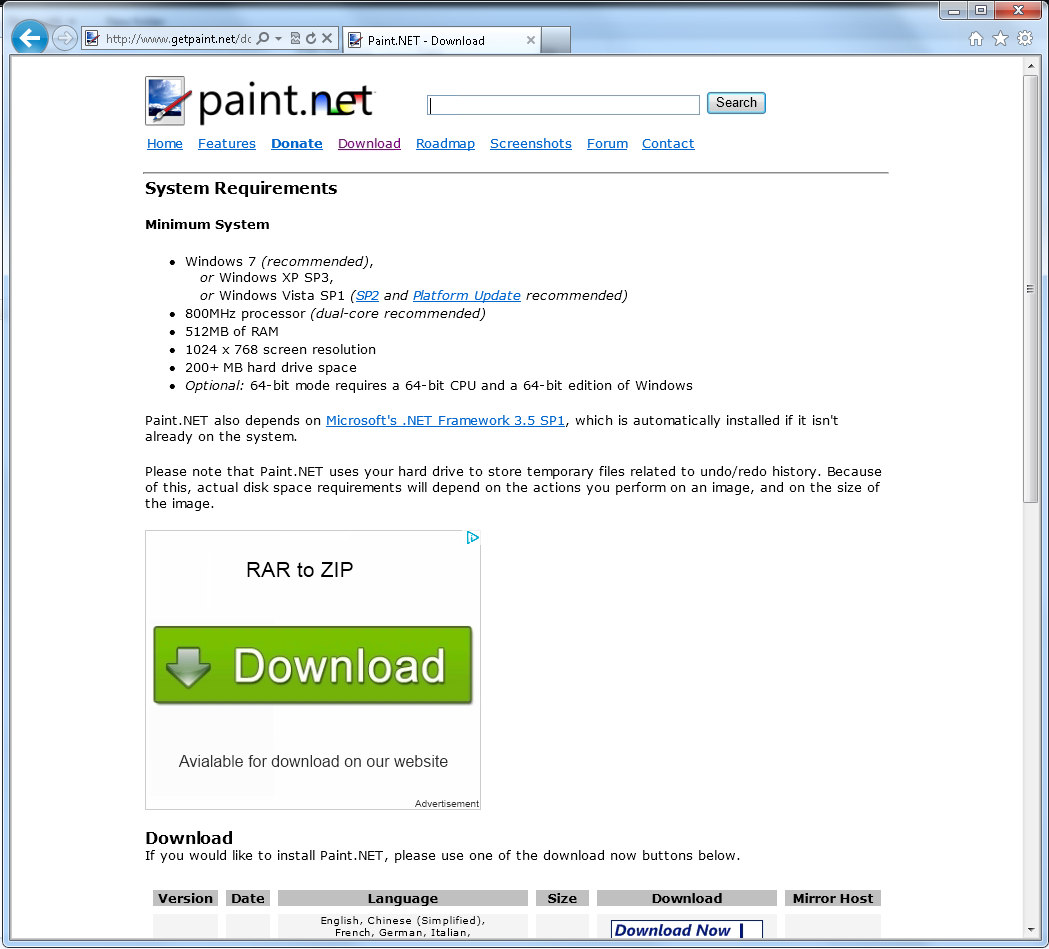 |
| Paint.net does it twice: on their download page, and then on the download host page. |
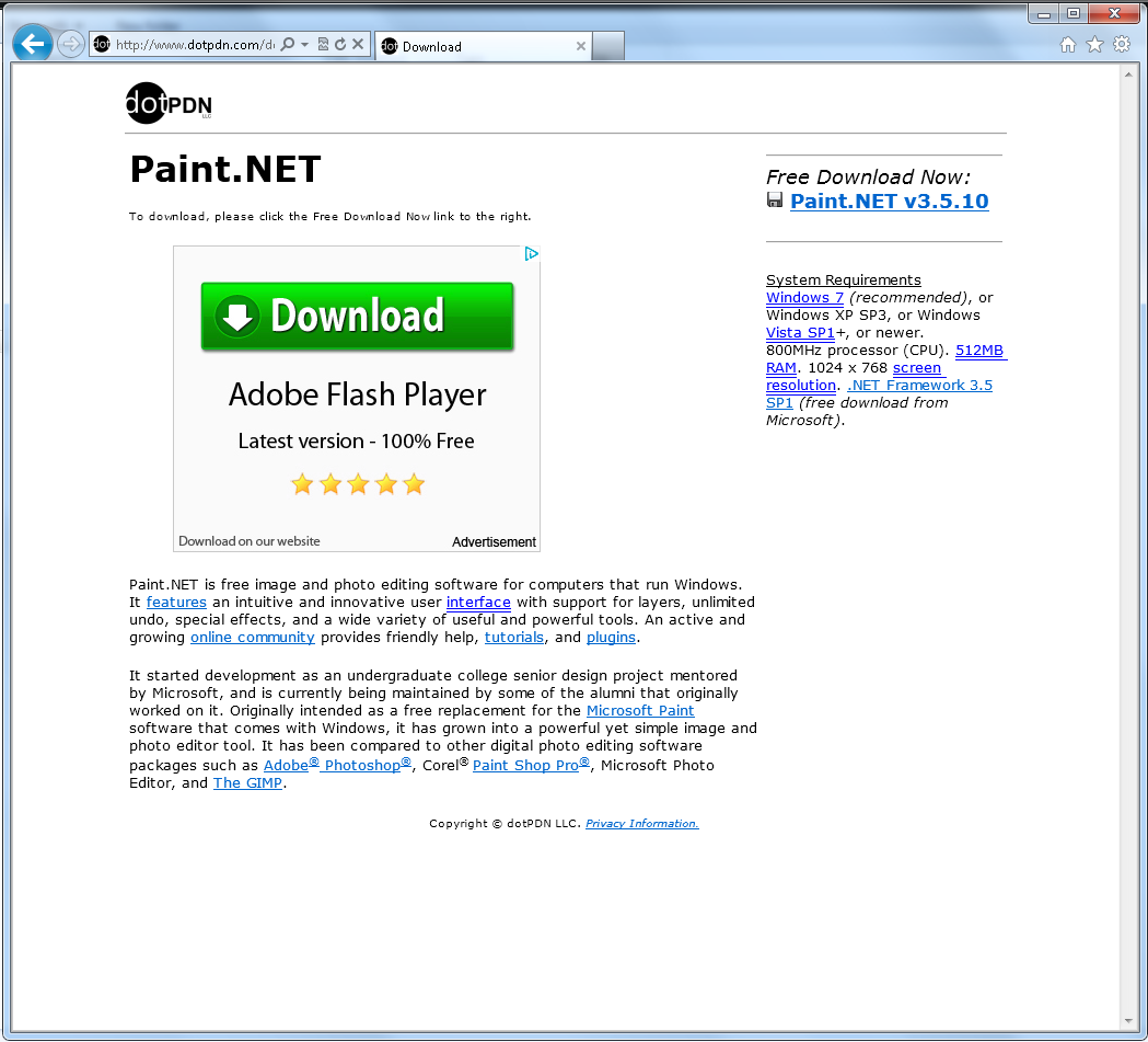 |
| Spot the real download link: it isn’t a big friendly green button, is it? |
| “Reputable” sites such as Sourceforge also do it. A little link for the real download. And big green Download buttons for the fake ones. |
| Four fake downloads at FileHippo. Can you see them all? |
| CNet manage to have two fake downlaods. Amazingly, slightly less offensive than most of the others, apart from the irritating animated ad. |
| Brothersoft is particularly bad. The actual download link is further down the page. I count ten download links above the fold. |
Developers, leaving ads like this on your software download pages hurts your users. Using file distribution sites such as the ones illustrated above, that bury your software download link among all their ads, hurts your users.
Inexperienced users will download the wrong program and end up frustrated and angry that you tricked them into installing rubbish they didn’t want.
More experienced users will usually see past the ads but it will still be a frustrating experience for them, and gosh does it look like seedy hour. It feels like visiting a warez site. Your reputation is tarnished. It’s nearly as bad as bundling toolbars (and we all know how that makes you look!) You look cheap. And nasty.
Gurus use Adblock. They won’t see your ads. You won’t get revenue from them. And over time, they are teaching the inexperienced users to install Adblock so that the less experienced users get the software they want, as well.
Note how Adblock do not have any other green download buttons but their own. Yeah, the page is ugly, but at least they got their download button right!
Get rid of those low-life ads! Build a reputation of delivering your software yourself, from your site, without misleading advertisements. That’s my rant done.

