Category Archives: Unicode

Creating and using an Internationalized Domain Name in July 2024

We needed to setup a web host for the domain convert.ភាសាខ្មែរ.com for an upcoming project. It should have been simple, but this turned into quite the journey.

A very brief background on IDNs

Some background. Notice the use of Khmer characters: ភាសាខ្មែរ /pʰiesaa kmae/ or “Khmer Language”. ភាសាខ្មែរ.com is a domain I’ve owned for some time, having purchased it when I was learning Khmer. Because this domain names uses letters not found in the English alphabet, it is considered to be an Internationalized Domain Name (or IDN). Now, behind the scenes, ភាសាខ្មែរ is not stored using Khmer characters in a Domain Name System (DNS) record. For reasons of history, domain names are restricted to a handful of Latin script letters, digits, and hyphen, and so the domain must be re-encoded using a system known as ‘punycode‘ (truly!)

The punycode representation of ភាសាខ្មែរ is the rather bamboozling xn--j2e7beiw1lb2hqg.

Now, most of the time, this gory detail will be hidden from you in the user interface of your browser — but if you copy the URL from the address bar and paste it into a text editor, you’ll be presented with the gory details! (The domain punycoder.com allows you to easily play with other scripts and non-English-alphabet names and see how they are punycoded.)

We needed a backend host with Python for the project, which ruled out a lot of free options — particularly since we wanted to bind to this custom domain name. As I had access to an Azure subscription already, I went that way.

So first, I attempted to create the domain quickly in the Azure Portal web front end. I had no trouble creating https://khconvert.azurewebsites.net/ — took just a few seconds. Then I had to bind our domain convert.ភាសាខ្មែរ.com to this azure hostname. But computer said no:

The name convert.xn--j2e7beiw1lb2hqg.com is not valid.

Fine, perhaps the UI needed the domain name as a Unicode string.

Hmm. Blocked again.

Now, often the Azure Portal does not allow you to do things which can be done via their APIs or with their az CLI tool. So I tried again with az.

PS> az webapp config hostname add --hostname convert.xn--j2e7beiw1lb2hqg.com --webapp-name khconvert --resource-group <REDACTED> --verbose
The name convert.xn--j2e7beiw1lb2hqg.com is not valid.
Command ran in 4.228 seconds (init: 0.493, invoke: 3.736)

Okay then … perhaps I have to use the non-punycode version of the hostname? After all, that error in the Azure Portal was purely in the UI — it didn’t even call into the API.

And it worked!

Side track: the old Powershell console did not do well with rendering Khmer in its default settings…

So it looks like those were not question marks? Interestingly, I can paste Khmer characters into the console, but I can’t copy them back out from the command — those letters copy out as question marks. Although as you can see from a screenshot and corresponding text later, I can copy the response and show it correctly. (Admittedly, I was using the old Powershell console, not Terminal, which probably would have none of these problems.)

But it worked, hurrah! We are done!

Well, not quite. We need a TLS certificate for the site. Fortunately, Azure supports creating certificates automatically for web apps.

But not for IDNs.

And not even the CLI saved me this time.

PS> az webapp config ssl create --hostname 'convert.?????????.com' --name khconvert -g <REDACTED> --verbose
This command is in preview and under development. Reference and support levels: https://aka.ms/CLI_refstatus
Operation returned an invalid status 'Bad Request'
Content: {"Code":"BadRequest","Message":"Properties.CanonicalName is invalid.  Canonical name convert.ភាសាខ្មែរ.com includes at least one special character. Only letters and numbers are allowed.","Target":null,"Details":[{"Message":"Properties.CanonicalName is invalid.  Canonical name convert.ភាសាខ្មែរ.com includes at least one special character. Only letters and numbers are allowed."},{"Code":"BadRequest"},{"ErrorEntity":{"ExtendedCode":"51021","MessageTemplate":"{0} is invalid.  {1}","Parameters":["Properties.CanonicalName","Canonical name convert.ភាសាខ្មែរ.com includes at least one special character. Only letters and numbers are allowed."],"Code":"BadRequest","Message":"Properties.CanonicalName is invalid.  Canonical name convert.ភាសាខ្មែរ.com includes at least one special character. Only letters and numbers are allowed."}}],"Innererror":null}

At this point, I threw my hands in the air, put the domain behind a Cloudflare proxy and used their SSL certificate, and it just worked.

But it is no wonder there are so few IDNs. The experience is still frightful. The errors are weird. We have a long, long way to go.

(Oh, and do take a look at ភាសាខ្មែរ.com and convert.ភាសាខ្មែរ.com: the problems they are playing with have quite a lot to do with IDNs too!)

The case for Keyman

Recent podcast

I was recently privileged to be a guest on Scott Hanselman’s Hanselminutes podcast. It was great to talk about the history of Keyman and how it solved real problems for us 20+ years ago. But afterwards I realised I hadn’t really described what sorts of problems Keyman solves today and why it is still relevant.

So this post is that story.

Note: I’ve put this on my personal blog rather than the Keyman blog because it’s full of my own personal opinions. There’s lots of useful content on the Keyman blog as well!

The elevator pitch – and why I always struggled with it

A common story around venture capitalists and tech startups is that you have to have an amazing elevator pitch, the idea that within about 20-30 seconds, you can sell a problem and its solution to a person just begging to give you great wads of cash. And if you can’t describe the problem in 20 seconds then you probably don’t understand it yourself.

With all due respect, that might be fine for selling package drones or IoT nerf guns, but there are plenty of hard problems out there that cannot be understood in 20 seconds.

I think keyboard input for the world’s writing systems is one of those problems. For many people growing up with limited contact with Asian writing systems, they will look pretty and exotic. But that’s about the extent of it.

So, let’s imagine you and I are in an elevator, and just as you ask me to explain the benefit of Keyman to you, the power goes out and the elevator lurches to a halt. Now you are stuck with me and I can give you the extended elevator pitch!

An illustration from Khmer

Khmer is the national language of Cambodia, a small nation in South East Asia, home of one of the world’s ancient wonders, Angkor Wat.

Photo by Marc Durdin

Here’s a couple of samples of Khmer text. The first is a photo of an inscription from Angkor Wat.

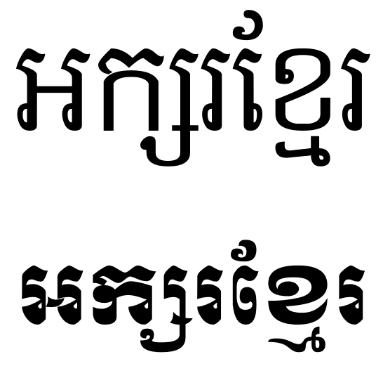
This second image shows two common styles for writing Khmer, as computer fonts:

In a little bit, I’ll dig into how the writing system is used on computer. The script is beautiful, and it is complex, and it has a long and interesting history.

But first, I would like to tell you a story. I recently learned about an effort by a group of Cambodian linguists to revise and prepare a new edition of a Khmer language dictionary. The current “gold standard” Khmer dictionary, compiled by Samdech Porthinhean Chuon Nath, has not been updated since 1967. So a new edition is very much needed.

A number of different people have been involved in typing up entries for the dictionary. In the process, they discovered a problem: some entries which looked identical on screen were actually encoded differently in the computer. This meant that they were unable to consistently search for words, or even sort their dictionary correctly.

How had this happened? This happened because it is possible to type Khmer words in a number of different ways and get identical output on the screen. And I don’t mean by using different input methods, either. I mean with the standard Khmer keyboard layouts supplied with all major operating systems, desktop and mobile.

The Khmer Script

In this post, I won’t get too technical with lots of references to Unicode encodings. Instead, I’m trying to illustrate the issues from the point of view of a user, who shouldn’t need to worry about those details.

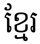
How would we go about typing a Khmer word? I’ve picked a famous Khmer word for us to start with:

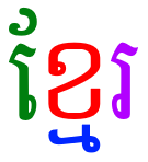
This is the word ខ្មែរ /kmae/, Khmer, which is the name of the language and the people.

So, with the standard Khmer keyboard, how do you type this word?

Let’s imagine you had this word on a piece of paper and a standard Khmer keyboard in front of you. We can tell that it’s made up of a group of characters and some sort of diacritic marks.

Start with the first shape. It looks like a   symbol and a  diacritic mark. But the two marks belong together and make up a vowel sound, which we can find on the [SHIFT]+[E] key:

Let’s go with that.

Next we have the  character and the diacritic mark. The first bit is easy enough to find, on the [X] key.

But that second bit? Okay, you won’t find that printed on a key cap. Fortunately, those using the Khmer keyboard tend to know their writing system. The character is a form of the  /m/ consonant used when it is the second letter in a consonant cluster. It is called a ជើង /cəəŋ/ letter in Khmer. This means leg or foot, base or support. (Diversion: The Unicode charts call them COENG consonants. I bet you read that as CO-ENG, didn’t you. I know I used to!)

Okay, that’s all very interesting but how does one type these cəəŋ consonants? Well, the Unicode encoding standard added a special control character that’s not part of the writing system, called a KHMER SIGN COENG (U+17D2), just to support these letters. This is typed with a [J] key on the standard keyboard. Now we’re getting somewhere. So we’ll need to type [J] [M] to get that  appearing under the .

Now before we go any further, this magic sign is a problem. It’s a problem because now the user has to know something about the way their text is encoded in order to type it. It’s not a particularly hard thing to learn, but it isn’t obvious. And this is one of the easier things that a native Khmer speaker needs to learn in order to type their own language.

The last letter is easy enough. Here it is on the [R] key.

The full sequence, first try

So the full sequence is: [SHIFT]+[E] [X] [J] [M] [R].

Let’s go ahead and type it.

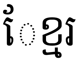
Ugh. Where did that dotted circle come from?

The dotted circle is a visual hint. It tells us that the vowel  is written before the consonant it is attached to, but that the encoding places it after.

Second try

Okay, so let’s change it to [X] [SHIFT]+[E] [J] [M] [R].

Okay, that looks correct now.

Well, okay, it looks fine … but it’s not. In order to meet the Unicode ordering rules, the vowel has to be placed after the entire consonant cluster, just as if it was spoken.

Third time lucky

Let’s go back and fix that again. Here’s our final sequence. [X] [J] [M] [SHIFT]+[E] [R].

This is the correct sequence.

Now from a linguistic point of view most of this seems fairly logical, and it generally makes sense to users, once they learn it. But I hope this illustrates how some of these things are not obvious. If you haven’t been taught these rules, or if you do accidentally mis-type something, you won’t ever know about it.

It’s not hard to find examples that have a heap of different ways you could type them. For example:

At first glance that doesn’t look a lot more complex, right? However, we’ve found 14 different ways to encode this in Unicode, all of which look correct on Android devices! And if you repeat diacritic marks, then you can expand that to over 35 different combinations, all displayed identically! My colleagues and I wrote a paper on the problem. Can you imagine searching an online dictionary with these kinds of problems?

Other parts of the solution

Now I know some of you are going to be saying that this isn’t a problem that is unique to Khmer. That it can be solved with post-processing and normalisation. And you are correct, this problem extends to many scripts. And some problems can be solved with normalisation. But I think Unicode normalisation is an appropriate solution only with correctly encoded data. Our goal is for data to be encoded correctly at the time it enters the system.

You might argue that Autocorrect-type technologies could help with this, and they certainly can. But again, Autocorrect is really targeted at spelling and word completion, not avoiding encoding issues. (The inconsistently available implementations of Autocorrect don’t help either).

Improved rendering engines could also give helpful visual feedback to users, alerting them to mistyped sequences.

But none of these negate the importance of what Keyman brings to the party.

Keyman: A Comprehensive Input Method Solution

So what does Keyman bring to this party? None of the system supplied Khmer keyboards make any attempt to quality control the input – generally they just output a single character for a single key.

Given we have well defined, structured linguistic and encoding rules, we can leverage those in the input method and ensure that sequences that are invalid according to the specification just don’t make it into the text store.

The power of Keyman

Keyman can automatically reorder and replace input as you type. For our example, if you type a vowel before typing a KHMER COENG SIGN and a consonant, Keyman will transparently and instantly fix the order in your document, and you won’t even know.

You can try a Khmer keyboard which automatically solves these encoding issues online at https://keymanweb.com/?tier=alpha#km,Keyboard_khmer_angkor

That, in a nutshell, is the power of Keyman.

Keyman makes possible amazingly intuitive input for complex writing systems.

Keyman is open source and completely free.

Keyman keyboard layouts are defined with a clear and easy to understand keyboard grammar, so that anyone can write a keyboard layout for their language. The development tools include visual editors, interactive debuggers and automated testing to help you develop sophisticated keyboard layouts.

Keyman runs everywhere. A keyboard layout can deployed to Windows, macOS, iOS, Android, Linux and even as a Javascript web keyboard. The Keyman project has a repository of over 700 existing keyboard layouts, and more are added every week.

Version 10 of Keyman is about to hit Beta. Would you like to be involved?

Oh look, the power is back on. Elevator pitch over. Oh by the way, aren’t writing systems cool?

The KeymanWeb Hello World app

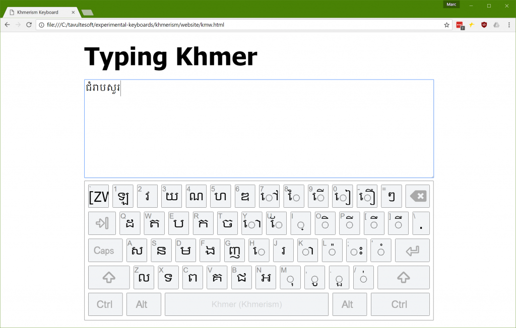
A couple of days ago I helped some developers put together a very basic web page that uses KeymanWeb to showcase their keyboard layout. The idea is that a visitor to the page will immediately be able to try out their keyboard layout without any fiddling around.

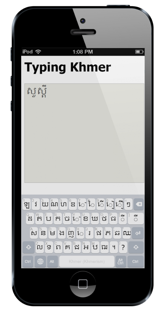
Another requirement was that the page work well on desktop and mobile devices. This requires a few little tricks, mostly because KeymanWeb has some special requirements to work smoothly on mobiles and tablets.

I’ve presented snippets of the code, in the order they appear in the document.

And here are screenshots just for posterity.

The usual HTML 5 boilerplate is thrown in at the top of the page. Our first trick is to put the page into an appropriate zoom and scroll mode for mobile and tablet devices with a viewport meta tag. This is done with the following code:

<!-- at present, KMW requires this for mobile -->
<meta name="viewport" content="width=device-width, user-scalable=no">

At the time of writing, KeymanWeb (build 408) requires the viewport meta tag in order to render correctly on a variety of devices. Both clauses in the content attribute are required, and the keyboard will not scale correctly without them.

Next, I add a link to the stylesheet for the on screen keyboard. This is optional, because KeymanWeb will inject the link itself anyway, but it does prevent a Flash Of Unstyled Content.

<!-- this is optional but eliminates a flash of unstyled content -->
<link href='https://s.keyman.com/kmw/engine/408/src/osk/kmwosk.css' rel='stylesheet' type='text/css'>

I throw in some basic styling for the desktop and touch devices. You’ll see a selector of body.is-desktop on a couple of the style selectors. I use this instead of a @media query because this is differentiating between viewport-controlled devices and plain old boring desktop browsers. There may be a better way of doing this now, but I haven’t found it yet. The code for setting the is-desktop class is found further on in this post.

/* Styles for the page */

* {
  font-family: Tahoma, sans-serif;
}

body.is-desktop {
  padding: 22px 2px 0 2px;
  width: 900px;
  margin: auto;
}

h1 {
  font-size: 24pt;
  font-weight: bold;
  margin: 0 0 24px 0;
  padding: 0;
}

body.is-desktop h1 {  
  font-size: 48pt;
}

/* Style the text area */

textarea {
  width: 100%;
  height: 250px;
  font-family: "Khmer OS";
  font-size: 24px;
}

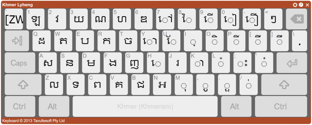
I need to talk a bit more about the On Screen Keyboard (OSK) styling. While I could use the default styling (as shown below), this looks a little dated and I wanted to show how the keyboard could be styled as you like. There is some complexity to the OSK styling as it has many moving parts, around sizing, scaling and positioning of each individual key. I don’t want to throw away that baby, so instead I keep all the bathwater and just add some bubbles to jazz up the display the way I want it. That’s a mixed metaphor, but it was late when I wrote this.

The default KeymanWeb keyboard style

First, this CSS rule-set removes the thick red border and dark background, and adjusts the padding around the sides to compensate.

/* Style the on screen keyboard */

body .desktop .kmw-osk-inner-frame {
  background: white;  
  border: solid 1px #404040;
  padding-bottom: 2px;
  padding-top: 8px;
}

Next, I hide the header and footer for the OSK. I don’t need them for this demo.


body .desktop .kmw-title-bar,
body .desktop .kmw-footer {
  display: none;
}

I tweak the spacing between keys and rows and make the keys slightly less rounded.

body .desktop .kmw-key-square {
  border-radius: 2px;
  padding-bottom: 8px;
}
body .desktop .kmw-key {
  border-radius: 2px;
  border: solid 1px #404040;
  background: #f2f4f6;
}
body .desktop .kmw-key:hover {
  background: #c0c8cf;
}

And that’s it for the CSS changes. It’s really pretty easy to restyle the keyboard without losing the benefits of a scalable, cross-platform keyboard. You’ll note that sneaky .desktop selector creeping in there. That’s because I’ve opted to style only the desktop keyboard; the touch layouts are already pretty nice and I’ll keep them as is.

I load the KeymanWeb code from the KeymanWeb CDN. You can load from the KeymanWeb CDN (running on Azure) or keep a locally hosted copy, of course. I’ve commented out the source version and because we have only a single keyboard, I have elected not to include a menu for switching languages.

<!-- Uncomment these lines if you want the source version of KeymanWeb (and remove the keymanweb.js reference)
<script src="https://s.keyman.com/kmw/engine/408/src/kmwstring.js"></script>
<script src="https://s.keyman.com/kmw/engine/408/src/kmwbase.js"></script>
<script src="https://s.keyman.com/kmw/engine/408/src/keymanweb.js"></script>
<script src="https://s.keyman.com/kmw/engine/408/src/kmwosk.js"></script>
<script src="https://s.keyman.com/kmw/engine/408/src/kmwnative.js"></script>
<script src="https://s.keyman.com/kmw/engine/408/src/kmwcallback.js"></script>
<script src="https://s.keyman.com/kmw/engine/408/src/kmwkeymaps.js"></script>
<script src="https://s.keyman.com/kmw/engine/408/src/kmwlayout.js"></script>
<script src="https://s.keyman.com/kmw/engine/408/src/kmwinit.js"></script>
-->

<script src="https://s.keyman.com/kmw/engine/408/keymanweb.js"></script>

<!-- Uncomment if you want the user to be able to switch keyboards with a toggle popup ...
or you can create a custom switch if you prefer
<script src='https://s.keyman.com/kmw/engine/408/kmwuitoggle.js'></script>
-->

Now, no self-respecting web developer is going to include inline script, except in a Hello World demo. So let’s call this the KeymanWeb Hello World demo, so I can keep my self respect. Or something.

I use a simple page load listener. You could use an earlier listener, such as DOMContentLoaded, but window.onload has a rich and nearly honourable history.

// This should really be in a separate file. 
// But for now in one file is easier to understand
       
// After everything has loaded
window.addEventListener('load', function() {

Next some voodoo. Allows me to style the touch and desktop versions differently, as I touched on earlier. Why? Because KeymanWeb works very differently on touch devices. If you think about this, it must be so. A touch device has its own soft keyboard, which KeymanWeb must, by slightly convoluted means, hide, and replace with its own soft keyboard. Whereas, on a desktop device, KeymanWeb can show a utility soft keyboard, but does most of its interaction by getting in there between the hardware keyboard and the input fields.

Don’t ask me about Windows touch devices. Does anyone actually use those? (Okay, I’m sure they do, but it’s a rocky path for us poor keyboard devs to tread!)

if(!tavultesoft.keymanweb.util.isTouchDevice()) {
  document.body.className += 'is-desktop';
}

Next, make sure KeymanWeb is initialised. If I don’t do this myself, KeymanWeb will do so when things are ready, but I need KeymanWeb to be ready in order to load keyboards and attach events, and so on.

tavultesoft.keymanweb.init();

I could add another keyboard, or a stock keyboard from the repository. I haven’t, but this shows you how.

//tavultesoft.keymanweb.addKeyboards('@eng'); // Loads default English keyboard from Keyman Cloud (CDN) if you want it

In this case, I have a custom keyboard, developed by Lyheng Phuoy. This is an early beta version of the keyboard but already it’s very impressive.

// Add our custom keyboard        
tavultesoft.keymanweb.addKeyboards({
  name: 'Khmerism',       // Display name of the keyboard
  id: 'lyhengkeyboard',   // ID of the keyboard for reference in code
  filename: './lyhengkeyboard-1.0.js',  // source of the keyboard for dynamic load
  version: '1.0',         // version of the keyboard, optional
  language: [{
    name: 'Khmer',        // language name for UI elements
    id: 'khm',            // language ID for tagging text
    region: 'as'          // region of the language, for UI elements, optional
  }]
});

In this section, I want to control the size, position and flexibility of the keyboard. I don’t want it to be resizable or movable. So I set nomove and nosize accordingly.

var ta = document.getElementsByTagName('textarea')[0];

// Watch for the keyboard being shown and set its position
        
tavultesoft.keymanweb.osk.addEventListener('show', function() {
  var rectParams = {
    left: ta.offsetLeft, 
    top: ta.offsetTop + ta.offsetHeight + 8, // a small gap below the text area
    width: ta.offsetWidth, 
    height: ta.offsetWidth * 0.4, // a pleasing aspect ratio
    nomove: true,
    nosize: true
  };
  tavultesoft.keymanweb.osk.setRect(rectParams);
});
      
// Focus text area after everything loads
        
ta.focus(); 

Finally, in the body element, I set a special magic class, osk-always-visible, so that KeymanWeb doesn’t hide its on screen keyboard after displaying it the first time. And then we have basically the world’s simplest page with a textarea.

<!-- The osk-always-visible class tells KeymanWeb not to hide the osk on blur, after it is
     shown the first time -->
<body class="osk-always-visible">
  <h1>Typing Khmer</h1>
  <textarea rows="6" cols="60"></textarea>	
</body>

And that’s it! I’d love to see what you do with KeymanWeb on your own sites.

Here’s the full keyboard source, and that link to the demo page again, including Lyheng’s keyboard (with his permission).

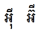
When ញ៉ាំ meets ញ៉ំា

The Khmer script was added to the Unicode standard in September 1999. Today, nearly 18 years later, operating system renderers still get it wrong.

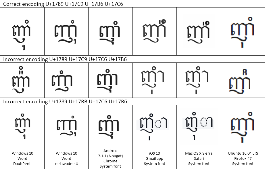
This is a quick post to document the difference in how several Khmer words are wrongly rendered on different current operating systems. I ran these tests on Windows 10 (10.0.14393), Android 7.1.1 Nougat, iOS 10.2.1, Mac OS X Sierra <> and Ubuntu 16.04 LTS with Firefox 47. The good news is that Windows 10 and Ubuntu passed all the tests (bar a font style issue with Leelawadee UI). Android passed nearly everything, except the bad encoding test.

Now, admittedly, the rules around triisap (U+17CA) and muusikatoan (U+17C9) are very complex. The Unicode standard description covers most of the difficulties, but not all of them.

Muusiaktoan is also sometimes called ធ្មេញកណ្ដុរ /tmɨɲ kɑndao/ – rat’s teeth, which is a fun name.

On to the words. In every case, the DauhPenh rendering is correct.

ញ៉ាំ /ɲam/ To eat

U+1789 U+17C9 U+17B6 U+17C6

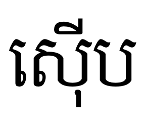
ស៊ី /sii/ To eat (for young)

U+179F U+17CA U+17B8

As of Mac OS X Sierra, /sii/ now displays correctly. But contrast with /ʔum/, /ʔom/ below.

អ៊ំ /ʔum/, /ʔom/ Uncle, aunt

U+17A2 U+17CA U+17C6

Note how Leelawadee UI renders this wrongly; but that is a font rather than a renderer bug.

ប៊ី /bii/ A type of egg roll

U+1794 U+17CA U+17B8

ប៉ី /pəy/ A type of wind instrument

U+1794 U+17C9 U+17B8

As of Mac OS X Sierra, /pəy/ now displays correctly. But contrast with /bii/ above!

Yum yum yum

ញ៉ាំ /ɲam/ To eat

I’d like to pull out the word ញ៉ាំ for further analysis. Every operating system has some trouble with this word, because it could be encoded in several different ways. The correct way works on everything except iOS and Mac OS X. The incorrect encodings should really display wrongly, but none of the renderers complain about both invalid forms!

Correct order (ញ៉ាំ)

U+1789 U+17C9 U+17B6 U+17C6

Incorrect order (ញ៉ំា)

U+1789 U+17C9 U+17C6 U+17B6

Incorrect vowel (ញុំា)

U+1789 U+17BB U+17C6 U+17B6

In this instance, The DauhPenh rendering is appropriate for the first and second lines; the Apple rendering is ironically most appropriate for the third line!

Many thanks to Makara for his suggestion on the second incorrect rendering; I updated this post shortly after initial posting to include the extra example. There are other possible letter orders which may or may not display “correctly”; I will leave finding these as an exercise for the reader.

ZWNJ FTW

Here’s one I’ll examine in detail another time. Some words can be written in two different ways, neither really incorrect. The Unicode standard caters for these by allowing for insertion of a Zero Width Non Joiner (U+200C) to force the superscripted form of triisap (៊) or muusikatoan (៉). Windows 10’s Leelawadee UI font gets this one wrong (but its DauhPenh font doesn’t).

អ‌៊ី or អ៊ី /ʔii/ An exclamation of surprise

U+17A2 U+17CA U+17B8
ZWNJ
U+17A2 U+200C U+17CA U+17B8

Note: table ZWNJ character order corrected as per comment by Olivier Berten.

Notes on a Khmer mobile keyboard for Keyman

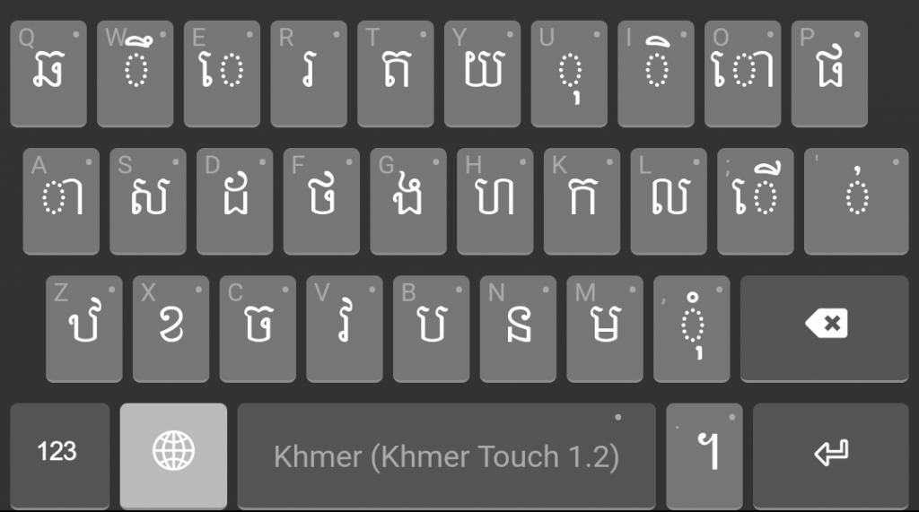
While other Khmer keyboards exist for iOS and Android, I wanted to try playing with one myself, given I am currently learning Khmer. Creating a keyboard layout is a great way to rapidly become very familiar with a script!

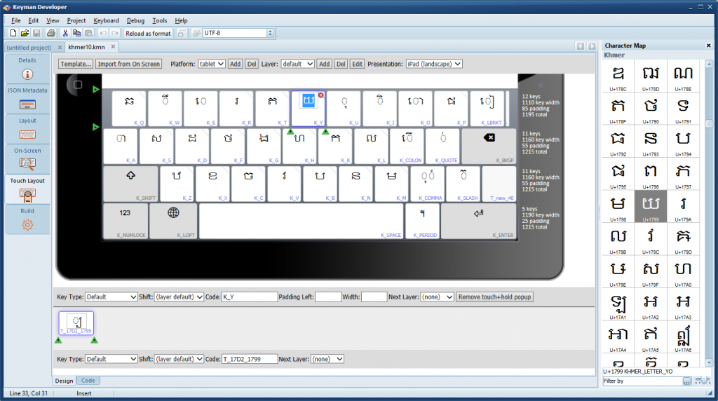
Keyman Developer makes it easy to play around with the layout of a keyboard and rapidly iterate the design. I was able to turn the original desktop layout into a mobile-optimised layout in under two hours, using only the visual editor.

keyman-developer

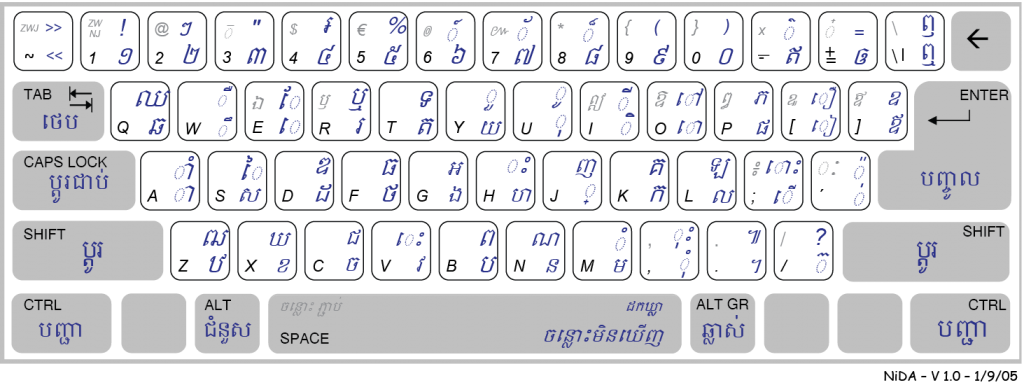
The base keyboard comes from the khmer10 Keyman keyboard created by Andrew Cunningham, which is based on the NiDA Khmer keyboard layout. This is a desktop keyboard, which follows a phonetic-style input, with letters placed as far as possible on keys with a similar sound in the English alphabet. For example, ក is on the [k] key.

Design principles

I had a number of goals I wanted to achieve with this keyboard.

A design good for a language learner

I wanted the design to help me remember the script, the sounds and related letters. This may not be optimal for a person fluent in the language, but for me, the NiDA layout’s phonetic-style layout was a good starting point.

Reduce the number of keys …

As the original design is for a desktop keyboard, there are too many keys to fit on a normal mobile layout. As a mobile keyboard should ideally have no more than ten keys in a row, I started with reducing that as one goal.

… But don’t lose all relationship with the desktop keyboard

I tried to avoid moving keys around on the keyboard, or removing keys other than the ones described below. This way, once I do become familiar with the mobile layout, it is not a difficult transition to using the NiDA layout on a desktop computer.

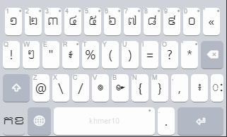
Move symbols and numbers off base layers

A number of non-alphabetic symbols are placed in a seemingly haphazard fashion on both the unshifted and Shift layers. The position of these symbols is probably pragmatic – the keys were available and not used for any other purpose. On a touch layout, we don’t need to maintain this because we can have as many or as few keys as we wish.

I moved all non-alphabetic symbols and numbers to a numeric/symbol layer.

symbol-numeric-layer

Relate sub consonants to base consonants

ក្ក  ក្ខ  ក្គ  ក្ឃ  ក្ង  ក្ច  ក្ឆ  ក្ជ  ក្ឈ  ក្ញ  ក្ដ  ក្ឋ  ក្ឌ  ក្ឍ  ក្ណ  ក្ត  ក្ថ  ក្ទ  ក្ធ  ក្ន  ក្ប  ក្ផ  ក្ព  ក្ភ  ក្ម  ក្យ  ក្រ  ក្ល  ក្វ  ក្ឝ  ក្ឞ  ក្ស  ក្ហ  ក្ឡ  ក្អ

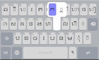
The original keyboard uses the key [j] as a prefix to create a sub consonant, by emitting the Unicode U+17D2 sub consonant marker character. This is a little obscure, and meant that the shapes of sub consonants were never visible on the keyboard.

I wanted to hide this encoding-based knowledge. I have added the sub consonants to the keyboard under a longpress menu for each base consonant, and added a rule to delete both the consonant and the prefix U+17D2 marker together when backspace is pressed. Thus, the average keyboard user need never know about the existence of U+17D2.

longpress-sub-consonant

Independent vowels

As these are less frequently typed than the dependent vowels, they really didn’t need their own key on the keyboard. Again, from a language learner point of view, placing the independent vowels under the related dependent vowel symbol, as longpress menus, helps me to learn the shapes more rapidly. It also means that I don’t confuse the independent vowel shapes with similarly shaped consonants on the layout.

Adding missing characters

The Khmer digits were already on the keyboard, but the Hindu-Arabic numerals were not. I added these as long-press under the Khmer digit keys on the numeric/symbol layer.

Things that are not yet right

This keyboard is nowhere near finished, but it’s now at a good point to start using it, before making further optimisations. After using it for a while, I will have a clearer understanding of what is uncomfortable or awkward to use, and will also probably have better ideas of how to resolve the issues.

Some of the issues I already know about are:

  • Still too many keys per row: some rows have 12 keys. I should try to reduce this to 10 keys.
  • There are vowel combinations that may or may not be necessary. These do not render correctly on most operating systems on the keyboard, but do when used in writing.
  • The backspace key should be either on the top row, or on the third row. It’s only on the second row at present because that was where there was space!
  • The keyboard is missing a number of symbols that I probably won’t be using for now, but should be available for a complete solution, such as the Lek Attak numeric divination symbols. Some archaic letters are also not yet present.
  • The Khmer OS fonts do not use the dotted circle for isolated diacritics, which makes them hard to read on the keyboard.
  • The layers are not precisely the same width, which leads to slightly disconcerting movement on layer switches.
  • The shift key on the shift layer is missing its icon.
  • I just realised the independent vowels are currently missing – I need to re-add those soon!

Screenshot on Android:

Issues with using the keyboard include:

  • iOS has rendering bugs with Khmer, for example ខ្ញុំ on iOS overlaps the two subscript marks.

khmer-on-ios-khnyom-render-bug


  • On Android, there are different rendering issues, for example the font is too large for the keys by default (showing the original keyboard as I don’t have an Android device handy for an up-to-date screenshot).

khmer-on-android-render-bug

Get the keyboard + source

Despite these limitations, the keyboard should be usable for typing most Khmer text today, as least on iOS. It certainly covers most of my needs as a language learner today. As such, I’ve made it available for install into Keyman for iPhone and iPad or Keyman for Android.

First, install the app from the appropriate link above. Then click the link below to add the keyboard to your device. I haven’t included a font in the keyboard, so you’ll need a device which already supports rendering the script.

Install the keyboard (version 1.1)

Install the keyboard (version 1.2)

New! Install the Khmer Angkor beta keyboard (version 1.0) – by Makara Sok

I welcome any feedback, of course!

The source of the keyboard is available on GitHub at https://github.com/mcdurdin/experimental-keyboards.

An update for EncodeURIComponent

Way way back in the dark ages of Delphi XE2, I wrote a function to encode components of a URI. Now, this function has been updated for use on mobile platforms, by Nicolas Dusart, and I quote Nicolas:

I had to make some modifications on it to compile for the mobile platforms, as the strings are 0-based on these platforms.

I also modified it to escape non-ASCII characters using their UTF-8 encoding as the standards advices. For multi-bytes characters, each byte is percent-encoded as usual.

Here’s the code, maybe it could interests you and the future readers of that article 🙂

And here’s Nicolas’s updated function in all its glory:

function EncodeURIComponent(const ASrc: string): string;
const
  HexMap: string = '0123456789ABCDEF';

  function IsSafeChar(ch: Byte): Boolean;
  begin
    if (ch >= 48) and (ch <= 57) then Result := True    // 0-9
    else if (ch >= 65) and (ch <= 90) then Result := True  // A-Z
    else if (ch >= 97) and (ch <= 122) then Result := True  // a-z
    else if (ch = 33) then Result := True // !
    else if (ch >= 39) and (ch <= 42) then Result := True // '()*
    else if (ch >= 45) and (ch <= 46) then Result := True // -.
    else if (ch = 95) then Result := True // _
    else if (ch = 126) then Result := True // ~
    else Result := False;
  end;

var
  I, J: Integer;
  Bytes: TBytes;
begin
  Result := '';
    
  Bytes := TEncoding.UTF8.GetBytes(ASrc);
    
  I := 0;
  J := Low(Result);

  SetLength(Result, Length(Bytes) * 3); // space to %xx encode every byte

  while I < Length(Bytes) do
  begin
    if IsSafeChar(Bytes[I]) then
    begin
      Result[J] := Char(Bytes[I]);
      Inc(J);
    end
    else
    begin
      Result[J] := '%';
      Result[J+1] := HexMap[(Bytes[I] shr 4) + Low(ASrc)];
      Result[J+2] := HexMap[(Bytes[I] and 15) + Low(ASrc)];
      Inc(J,3);
    end;
    Inc(I);
  end;
    
  SetLength(Result, J-Low(ASrc));
end;

Many thanks, Nicolas 🙂

How to render combining marks consistently across platforms: a long story

I read today Richard Ishida’s notes on his experiences displaying combining characters in a consistent way across browsers, and recalled with fondness the pain we have experienced with this, both in browsers and in apps, over many years.

When we design a keyboard layout for Keyman, we will often want to show a diacritic mark or combining character from a complex script by itself on a key cap, or show the mark with a substituted placeholder symbol that is distinct from the script itself, to show how the combining character fits with the base letter.

A commonly used placeholder symbol is ◌ U+25CC DOTTED CIRCLE, but there are others that are preferred for some languages.

U+25CC

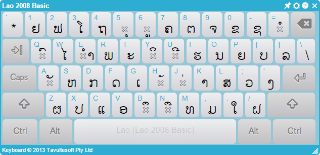
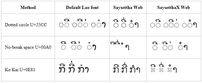
I show below three attempts at presenting the combining marks on our Open Source KeymanWeb platform keyboards, running in Chrome on Windows 8.1. The first shows a Lao keyboard, with each of the combining characters presented around a base  U+0E81 LAO LETTER KO on the keyboard. As you can see, this is not wonderful because the Ko Kai letter adds noise and makes it hard to pick out the combining characters.

Lao keyboard on keymanweb.com

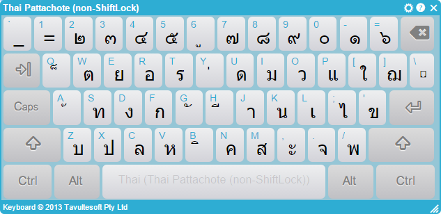
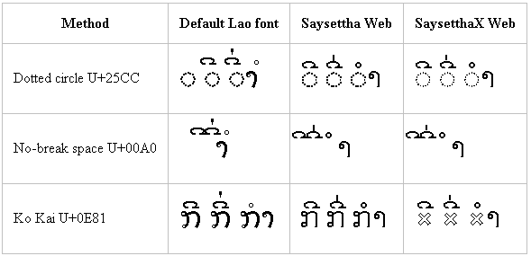
The second keyboard is Thai. This relies on the system renderer and does not include a base character for the combining characters. In this case, that means that no base letter is shown and the marks show reasonably clearly. Unfortunately, this is not reliable across platforms, browsers or languages — it happens to work okay for Thai in Chrome on Windows 8.1.  On some other systems, the combining marks are shifted to the far left of the key cap, or even off the key entirely.

Thai keyboard on keymanweb.com

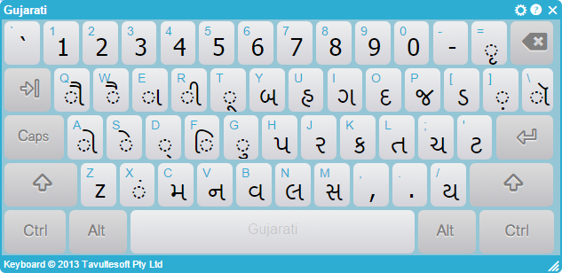
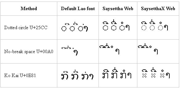
The third keyboard example is for Gujarati, and again relies on the system renderer and does not include a base character for the combining characters. Now this time you see that the Uniscribe renderer on Windows 8.1 automatically inserts a dotted circle glyph — this may or may not be the same as the U+25CC character. Again, this behaviour differs across platforms.

Gujarati keyboard on keymanweb.com

The Story Today

The story today is pretty unfortunate. Display of isolated combining marks is not implemented at all consistently across the plethora of rendering engines, operating systems, browsers and fonts. Some systems will automatically insert a placeholder glyph if no conforming base character is found prior to the combining character. Others don’t. What do I mean by a conforming base character? Well, that’s up to the implementation of the renderer. Some renderers will treat any base character that is not in the same script as the combining character as part of a separate run, and won’t attempt to combine. Others will combine with some outside-script characters but not others.

Things get even worse when working with multiple combining characters without a base character. Unless this has been specifically handled in the renderer, you will typically see poor layout or rendering of the characters that may not be representative of how they form above normal base characters.

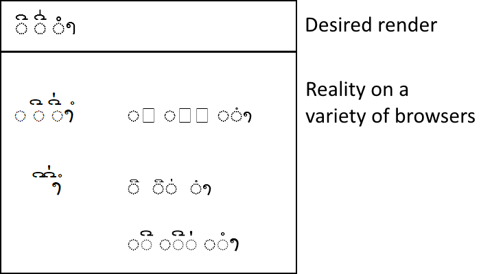
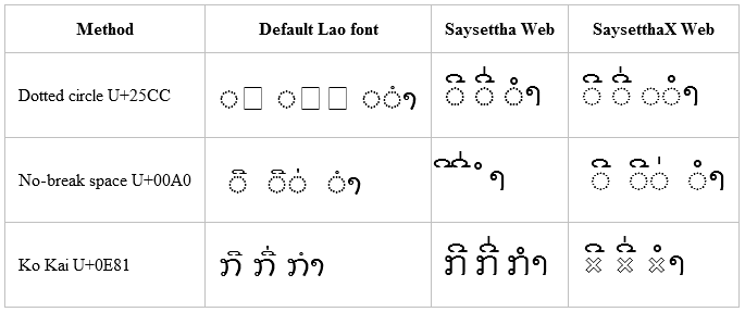
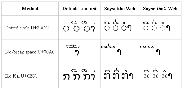
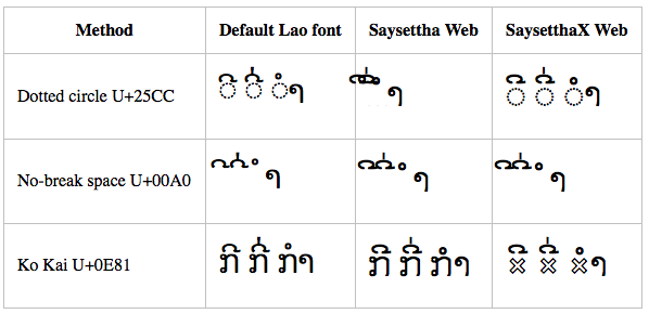
The image below shows examples of the marks U+0EB5 LAO VOWEL SIGN II, U+0EB5 LAO VOWEL SIGN II + U+0EC8 LAO TONE MAI EK and U+0EB3 LAO VOWEL SIGN AM, rendered with and without U+25CC DOTTED CIRCLE, on various systems. A more comprehensive set of examples is included later in this blog.

Sample Lao combining character renders
Sample Lao combining characters rendered

You can see, in the image above, examples of:

  • Repeated dotted circles
  • Diacritics that don’t align over their base character correctly
  • Rendering errors leading to tofu
  • Diacritics that don’t stack
  • Marks that overlap incorrectly

None of the basic text-only solutions work consistently across all systems.

It’s like stuffing a live octopus into a box

Attempting to address the problem is not fun. Fixing the problem on one browser/renderer/OS/font system invariably creates a new problem on another system. It’s like stuffing a live octopus into a box: each time you manage to get one of those pesky tentacles into the box, two others have snuck out the other side.

A Solution

We worked hard to find a consistent cross-browser solution. We started with Lao, but we believe that the same principles can be applied to other scripts. The solution relies on web fonts, but falls back to an acceptable solution in the shrinking subset of systems where web fonts are not supported.

We started by creating a font that is designed for use specifically with the On Screen Keyboard — it would never be used for presentation or editing. While at first glance this meant we could easily solve the problem by placing all the required marks into the Private Use Area, doing so would mean that on systems where the font was not available, the keyboard would be unusable.

Our final solutionhack uses the OpenType GSUB feature to replace the  U+0E81 LAO LETTER KO with a placeholder mark when, and only when, it is used as a base character for a combining mark. The keyboard presentation code stores the Ko Kai letter as a base character for each combining character (or characters), and at render time the font substitutes its placeholder mark. When a key with this pair of characters is clicked, only the combining mark is displayed.

Lao keyboard with substituted base

Doing this means we can use the Ko Kai letter by itself on the keyboard (on the D key) without a problem (for example on its own key), and in the case where the special font is not available, the user will see an acceptable fallback with the Ko Kai letter as the base character for combining characters.

It’s worth noting that many renderers require that the placeholder character be the same font and style as the combining characters. Today, this sadly precludes using a different colour for the placeholder character.

Examples

I have collected screenshots from a variety of browsers that illustrate some of the inconsistencies and frustrations, as well as the happily correct rendering. You can also visit the sample page to see how well the rendering works in your system.

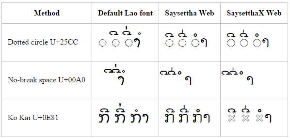
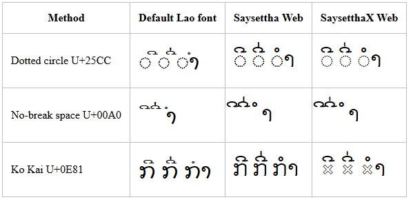
The screenshots include three combinations:

  • A simple single U+0EB5 LAO VOWEL SIGN II
  • A pair of diacritic marks U+0EB5 LAO VOWEL SIGN II + U+0EC8 LAO TONE MAI EK
  • A third combining character U+0EB3 LAO VOWEL SIGN AM

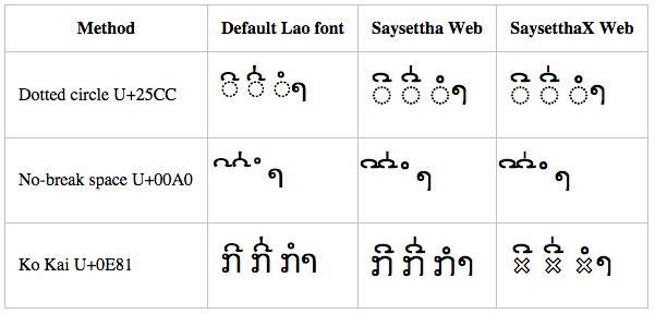
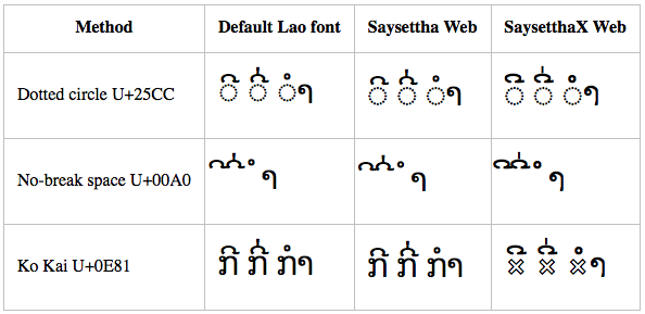
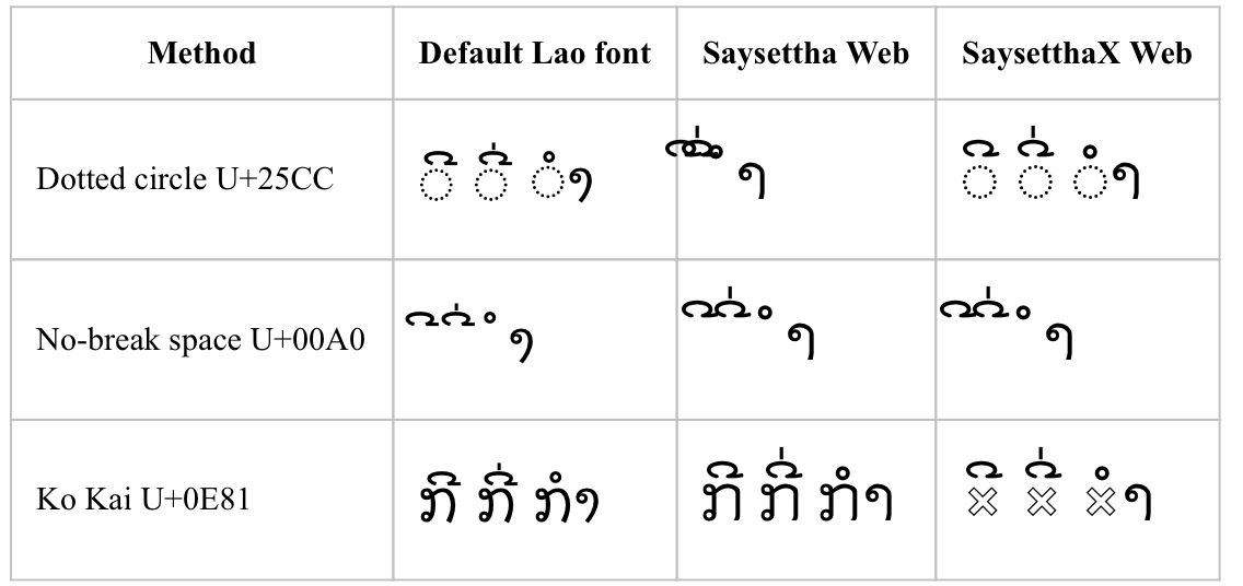
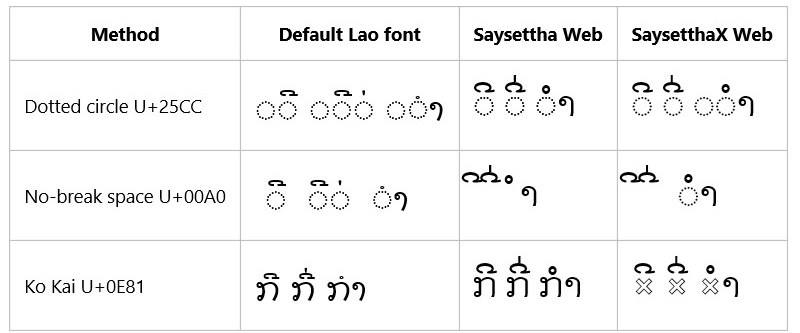
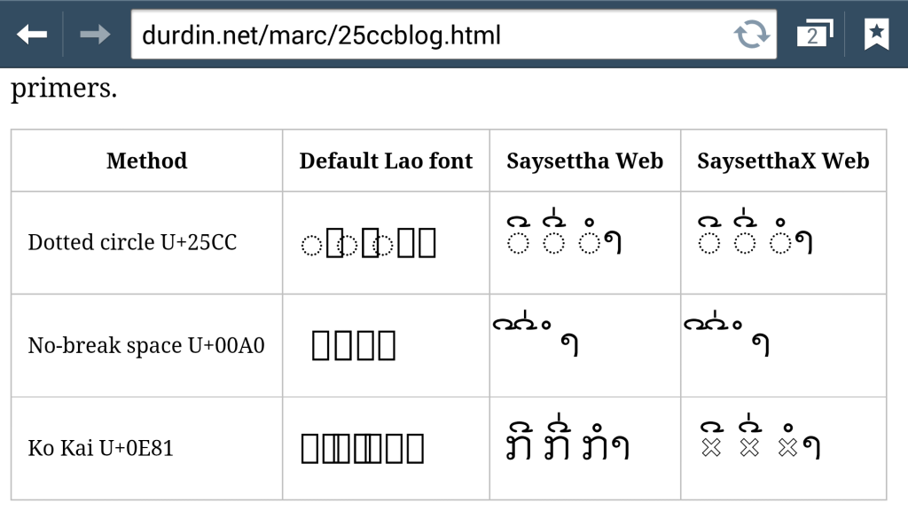
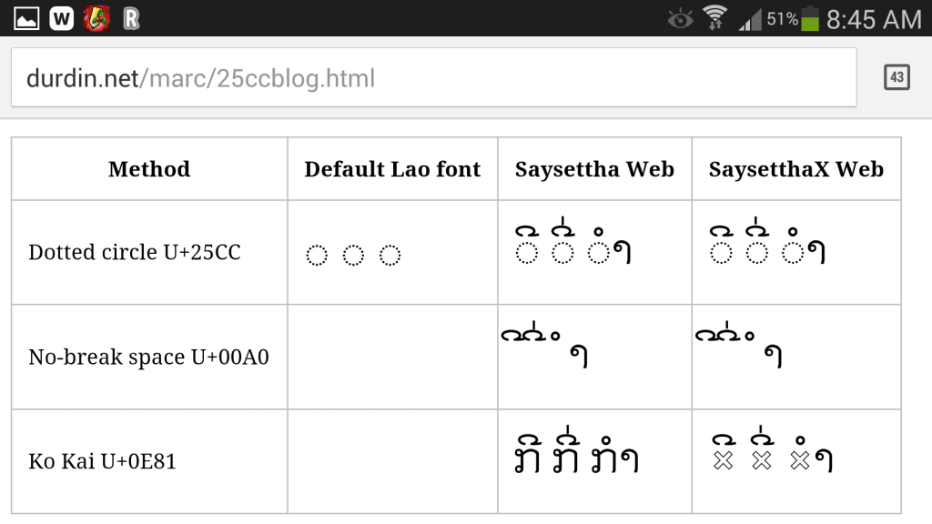
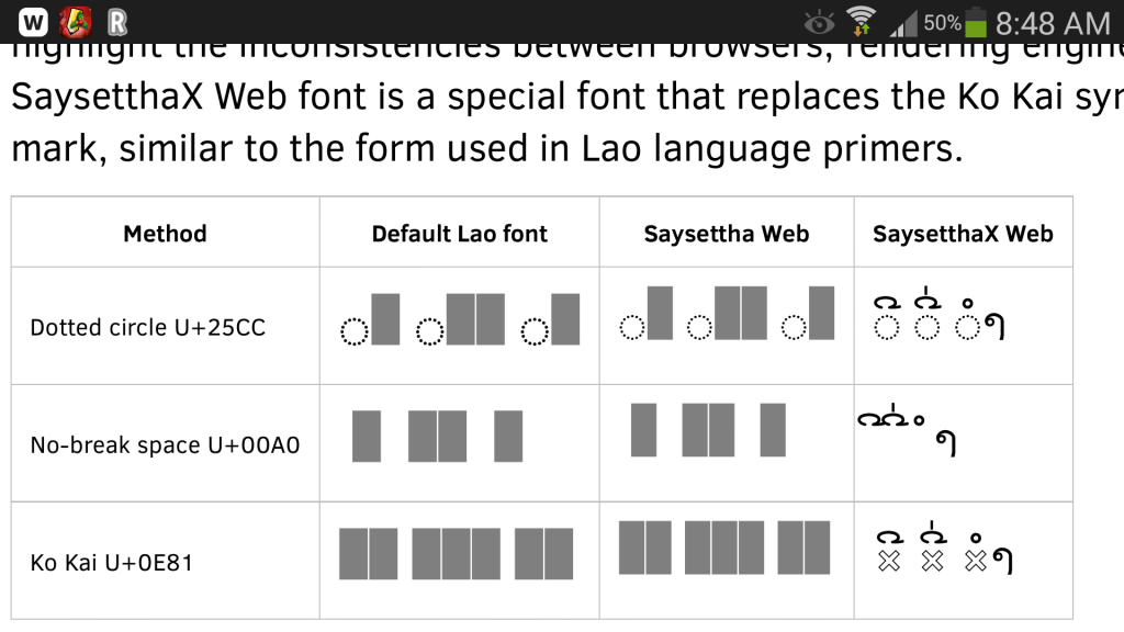
The sample shows these three combinations with the default font for the system, a Lao OpenType font “Saysettha Web”, and the special font “SaysetthaX Web” which has our hack in it, along with three different base characters: a hard-coded U+25CC DOTTED CIRCLE, a U+00A0 NO-BREAK SPACE, and a U+0E81 LAO LETTER KO.

Initially, the dotted circle with the Saysettha Web font looks hopeful.  But in the end you will see that only one solution works on all browsers tested: the bottom right cell with the custom font and the Lao Letter Ko. The “hollow x” glyph that we use in this font is similar to the placeholder used in Lao language primers. However, any shape can of course be used here if you are creating your own font.

Windows 8.1 – Internet Explorer

Windows 8.1 - Internet Explorer 11


Internet Explorer 11 on Windows 8.1 does surprisingly badly here — worse than earlier versions of Windows.  Notice how the default Lao font (DokChampa) does not combine with dotted circle, nor does it combine the pair of diacritics correctly with no-break space.

Windows 8.1 – Chrome

Windows 8.1 - Chrome


While Chrome stacks the pair of diacritics correctly in all cases, the positioning for Dok Champa relative to the base character is incorrect for both dotted circle and no-break space. You can also see how the Saysettha Web and SaysetthaX Web fonts position their diacritics to the left of the cell in the case of the no-break space.

Windows 8.1 – Firefox

Windows 8.1 - Firefox


Firefox renderers similarly to Chrome. Note that it appears to be using Lao UI instead of DokChampa for the default font.

Windows 7 – Internet Explorer

Windows 7 - Internet Explorer 9

Windows 7 – Chrome

Windows 7 - Chrome


(Font smoothing was not enabled on the remote connection when I captured the screenshot)

Windows 7 – Firefox

Windows 7 - Firefox

(Font smoothing was not enabled on the remote connection when I captured the screenshot)

Windows XP – Firefox

Windows XP - Firefox


(Font smoothing was not enabled on the remote connection when I captured the screenshot)

Mac OS X – Safari

Mac OS X - Safari


Here we see the Saysettha Web solution with dotted circle, which worked consistently in Windows, fails in Mac OS X. Cross-platform support comes back to haunt us. Get back into that box, O tentacle!

Mac OS X – Chrome

Mac OS X - Chrome

Mac OS X – Firefox

Mac OS X - Firefox

It appears that Firefox is having trouble loading the Saysettha Web font, although the SaysetthaX Web font is loading, so this problem is probably resolvable.

iOS 8.1 – Safari

iOS 8.1 - Safari


This is at least consistent with the situation in Safari on Mac OS X 10.8!


Windows Phone 8.1 – Internet Explorer

Windows Phone 8.1 - Internet Explorer 11


This is similar, but not identical to Internet Explorer 9 on Windows 7. That would be too easy!


Android 4.3 – Android Browser

Android - Android Browser


Clearly, no Lao font was available on the system, so the web fonts were the only ones that worked.

Android 4.3 – Chrome

Android - Chrome

Clearly, no Lao font was available on the system, so the web fonts were the only ones that worked.

Android 4.3 – Firefox

Android - Firefox

Clearly, no Lao font was available on the system. It also appears that Firefox is having trouble loading the Saysettha Web font, although the SaysetthaX Web font is loading, so this problem is probably resolvable.

Conclusion

In summary, the only solution today for on screen keyboards (or character pickers) that works consistently across all browsers is to create a custom font with what can only be classed as a hack, and supply that font for use within those pickers / on screen keyboards.

I certainly agree with Richard that a more formalised solution based on U+00A0 no-break space or U+25CC dotted circle would be fantastic.

iOS 8 beta 1 — first bug reports

Like every other iOS developer, I have already downloaded and installed XCode 6 and the first beta 8.0 of iOS onto one of my test iDevices. And, like every other IOS developer, I immediately went to go and test one of my apps on the new build. And, unfortunately, as can be expected with a beta, I found a bug. I have dutifully filed a bug report via Apple’s bugreport.apple.com!

Given that bug reports are private, I have opted to make information public here because I have had many, many of my product users ask me about it: the bug first arose with iOS 7.1 and I had hoped that it had been addressed in 8.0. Most of my users are not technical enough to be able to navigate the bugreport.apple.com interface, so their only recourse is to complain to us!

Bug #1: Custom font profiles fail to register and work correctly after device restart

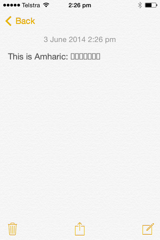
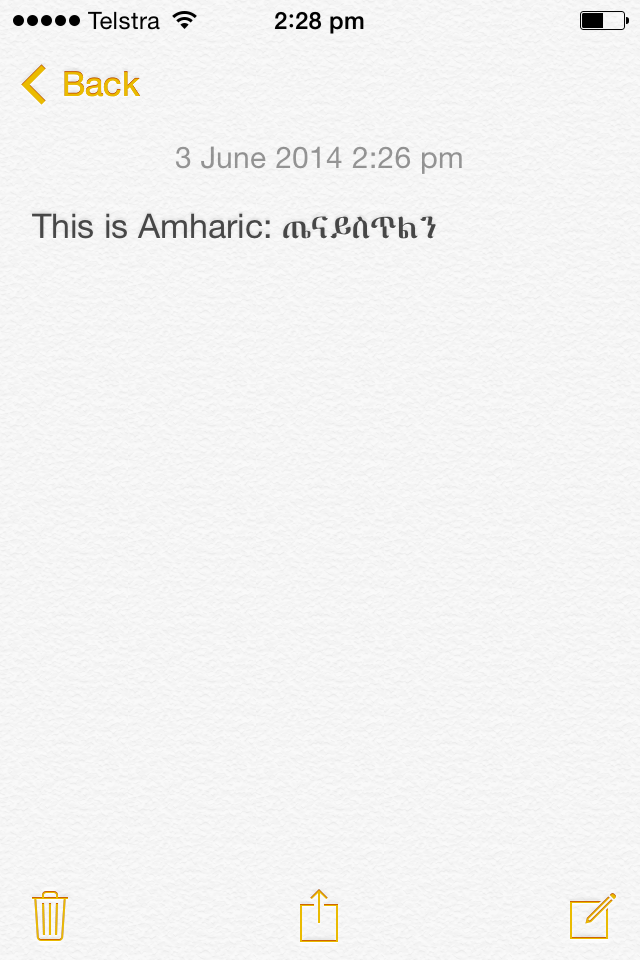
We have developed a number of custom font profiles for various languages, following the documentation on creating font profiles for iOS 7+ at https://developer.apple.com/library/ios/featuredarticles/iPhoneConfigurationProfileRef/iPhoneConfigurationProfileRef.pdf. Each of these profiles exhibits the same problem: after the font profile is installed, the specific language text usually displays in all apps, including Notes, Mail and more. However, as soon as the device is restarted, the font fails to display in any apps. In some cases, residual display of the font continues after the restart, but any edit to the text causes the display to revert to .notdef glyphs or similar.

Amharic text -- square boxes
Amharic text before the font profile is installed — square boxes

Amharic-Text-Notes-Success
Amharic text after the font profile is installed: now readable.  But not for long.

Even before the device is restarted, font display is sometimes inconsistent. For example, if you shutdown mail and restart it, fonts will sometimes display correctly and sometimes incorrectly.

The samples given are using the language Amharic.  The font profile can be installed through my Keyman app, available at http://keyman.com/iphone.

A sample of text in Amharic is ጤና ይስጥልን (U+1324 U+1293 U+0020 U+12ED U+1235 U+1325 U+120D U+1295).  This text displays correctly when the font profile is first installed, in some situations, and always displayed correctly in iOS 7.0.   The issue first arose in iOS 7.1 and has continued into the iOS 8.0 beta.

References:

Bug #2: Touches on fixed elements in Safari are offset vertically

In Safari in iOS 8.0 beta 1, I have found that touching fixed elements often results in a touch which is 200-odd pixels north of the actual location I touch.  No doubt plenty of people will report this one!

Even charset geeks can be fooled by character spoofing

I was preparing a new git repository today for a website, on my Windows machine, and moving a bunch of existing files over for addition.  When I ran git add ., I ran into a weird error:

C:\tavultesoft\website\help.keyman.com> git add .
fatal: unable to stat 'desktop/docs/desktop_images/usage-none.PNG': No such file or directory

How could a file be there — and not there?  I fired up Explorer to find the file and there it was, looked fine.  I’d just copied there, so of course it was there!

usage.png seems to be there just fine

For a moment, I scratched my head, trying to figure out what could be wrong.  The file looked fine.  It was in alphabetical order, so it seemed that the letters were of the correct script.

Being merely a bear of little brain, it took me some time to realise that I could just examine the character codepoints in the filename.  When this finally sunk in, I quickly pulled out my handy charident tool and copied the filename text to the clipboard:

usage-none-selection

And pasted it into the Character Identifier:

usage-none-charident

With a quick scan of the Unicode code points, I quickly noticed that, sure enough, the letter ‘g‘ (highlighted) was not what was expected.  It turns out that U+0261 is LATIN SMALL LETTER SCRIPT G, not quite what was anticipated (U+0067 LATIN SMALL LETTER G).  And in the Windows 8.1 fonts used in Explorer, the ‘ɡ‘ and ‘g‘ characters look identical!

g-g
I checked some of the surrounding files as well.  And looking at usage-help.PNG, I could see no problems with it:

usage-help-charident

So why did git get so confused?  OK, so git is a tool ported from the another world (“Linux”).  It doesn’t quite grok Windows character set conventions for filenames.  This is kinda what it saw when looking at the file (yes, that’s from a dir command):

usa[]e

But then somewhere in the process, a normalisation was done on the original filename, converting ɡ to g, and thus it found a mismatch, and reported a missing usage-none.PNG.

Windows does a similar compatibility normalisation and so confuses the user with seemingly sensible sort orders.  But it doesn’t prevent you from creating two files with visually identical names, thus:

double-usage-none

I’m sure there’s a security issue there somewhere…